Showing posts with label research methods. Show all posts

Tuesday, March 17, 2020

Death from Despair Part 5: Analysis by Race, by Race Crossed with Gender, by Race, Gender and Age (Analysis of American Indian/Alaskan Native and White Males by Age)

1. Analysis by Race

American Indians/Alaskan Natives consistently have the highest rate of death. That is followed closely by Whites. That the Total line closely follows the White line is unsurprising given that Whites form the largest racial group.  African Americans and Asians fall below the Total line. As we have seen earlier the line for African Americans has risen sharply in the last few years because of sharp increase in drug-related deaths. Asians may have the lowest death rate however, the death rate for Asians continues to rise, not at the accelerated rates of the three groups, but are rising nevertheless. 


Of concern, deaths from despair continue to rise for everyone no matter your racial group.


2. By Race and Gender

I further subdivided the data by gender. In the figure below, females are represented by squares and males by circles. 

Every group has shown an increase in deaths from despair, even female Asians who clearly show the lowest rate of increase. As a whole, females show a lower death rate than males. One notable exception is that male Asians have a lower death rate than American Indian/Alaskan Natives and female Whites.

What I find particularly striking about this graph are the lines for American Indian/Alaskan Native Males and White Males. Both lines follow a steeper trajectory with strikingly higher death rates than the other groups. What I find striking as well is that these two lines closely follow each other. And for those two reasons I decided to drill into the data from these two groups with Age as a factor.

3. Analysis of American Indian/Alaskan Native Males and White Males


I added age as an analysis factor for these two groups. The figure below shows the results of that analysis.

American Indian/Alaskan Native male lines have downward pointing triangles. White males have circles. 

Something to note: American Indians/Alaskan Natives have jagged lines. The reason is that the underlying numbers are relatively small so a relatively small change can seem to show large swings in the crude rate. That being the case one needs to focus not on the swings but on the overall trends that unfortunately point strongly upward.

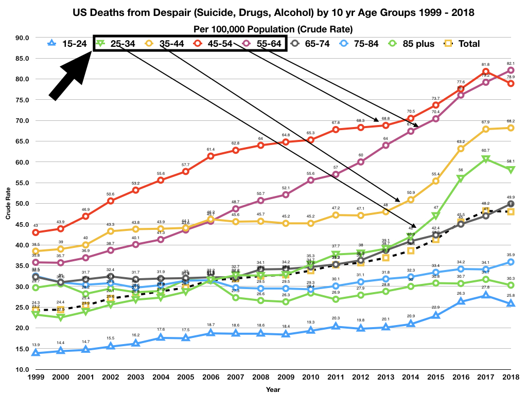
I selected most productive years in 10 year age ranges that consist of the 10 year age ranges of:
  • 25-34
  • 35-44
  • 45-54
  • 55-64
For both American Indian/Alaskan Native males and White males the most deadly years range from 45 to 64. For American Indian/Alaska Natives males those years have proven particularly deadly, especially in recent years. And it is clear, that for American Indians/Alaskan Native males, deaths from despair begin relatively early in life and become more strongly pronounced as they grow older.

Something that interested me was the American Indian/Alaskan Native and Whites show similar patterns in the 25 to 34 age range. 

Two more figures separately show American Indians/Alaskan Native and White males.


These two groups are clearly at the most risk for death from despair and the numbers are staggeringly high.

This series of articles will continue. 


Monday, March 2, 2020

Death from Despair Part 4: Analysis by Age Groups


This data was collected from CDC's Wonder database for all the years available: 1999 to 2018. They're broken down into 10 year age groups from 15 to 85 (plus) years old. I removed from the figures the age groups for everyone under 15 years old and all those where the age the person was not reported. The under 15 years old age group data showed crude rates of less than 1 death per 100,000, too low to be included in the figures.

Deaths from Despair by Age Group

The figure below shows the crude rates of death from despair by age group. The dashed line curve is the overall total for all age groups to provide a baseline of comparison and a dividing line for those over, under and on the line. 

As seen in other studies two age groups, 45-54 and 55-64, show the highest growth rate  as well as the highest number of deaths from despair. Those in the 65-74 age group closely follow the Total line.   


I inserted the figure above to call attention to something that I found particularly disturbing. The age groups I have boxed are those ages that could only be considered "the prime of life." One would consider these to be the best years of anyone's life. (I know I do.) Yet in recent years, the rate of death from despair are 1) above the Total baseline and 2) the highest of all the age groups. Furthermore, the growth rates for the 25-34 and 35-44 age groups has noticeably jumped over the last 5 years.

The two age groups with little or no growth are the 75-84 and 85+ groups. Furthermore, they're below the baseline. 

The 15-24 age group has the lowest crude rate, but it's a crude rate has nearly doubled during this 20 year period and that is concerning.

Finally, to point out that during 1999, the data points for most of the age groups were in a much closer range (from 13.9 to 43.0) than in later years where the spread has become much wider from a crude rate of 25.8 to 82.1. 

Monday, February 24, 2020

Deaths from Despair Part 3: Across US Metropolitan Areas

When I was analyzing suicide data, I subdivided the data by a variety of factors, both by single factors and multiple factors. One of those factors that proved itself as something of interest was the metropolitan area where the suicide victim resided. What I found was that the smaller the metropolitan area, the higher the suicide rate relative to the other metropolitan areas in each year. This was particularly true in more recent years. Since, death by suicide is one of measurements included in death from despair it makes sense to examine this data using as a factor in the analysis, metropolitan area. 

The figure below shows the death rate from despair for the six 2013 US metropolitan areas. The death rate for all metropolitan areas is shown as a dashed line.

Several things jump out from the figure above:
  • The rate of death from despair from 1999 to 2018 has doubled and no metropolitan area has been spared.
  • Death rates dropped from 2017 to 2018 except for large metropolitan and noncore areas.
  • In 1999 large central metropolitan areas had the highest rate of death from despair. However, by 2018, they had the lowest rate. 
  • In 1999 large fringe metropolitan areas had the lowest rate of deaths from despair while the other metropolitan areas were more tightly bunched.
  • Over time, two clusters have developed: 1) large metropolitan areas and 2) medium-small metropolitan areas. Large metropolitan areas fall under the overall rate while the medium-small metropolitan areas are over the overall rate.
The figure below shows the year to year trends for large and medium-small metropolitan areas. And the figure that follows shows the year to year differences between the rates of death from despair for medium-small and the large metropolitan areas. 


These two figures show that while death rates from despair have increased dramatically in both clusters, the gap between large and medium-small metropolitan areas has grown over time with more deaths from despair occurring more frequently in medium-small metropolitan areas than in large metropolitan areas.

One of the reasons for the difference in rates of death may in part be due to the fact that economic opportunities have continued to shift to large metropolitan areas and economic opportunities continue to diminish in medium-small areas. That may help explain the difference we're seeing between large and medium-small areas. However, deaths from despair continue to increase in all metropolitan areas at an alarming rate. If economic opportunity were the explanation, then one would expect large metropolitan areas to be showing a dramatically lower rate of increase or no increase at all or maybe even a decrease in the rate of death from despair, but that's not what we're seeing. 

Deaths from despair have been increasing, but they have been increasing at a faster pace in medium-small than in large metropolitan areas in the US. 

Wednesday, February 19, 2020

Deaths from Despair Part 2: Gender as a Factor

Before I get into the data, I want to mention that the 2018 data has been loaded on the CDC's Wonder database (https://wonder.cdc.gov). I'll update some of recent findings using this new data. The new data has changed my projections for 2025. They're less dire than my earlier projections, nevertheless, they're still unacceptable. I'll discuss the updated projections at the end of this article.

My approach in this series of articles is to first consider single factor comparisons before I drill down into multi-factor comparisons and trend analysis. In this article I focus on gender. In later articles I'll focus on age, race, Hispanic, size of the community, etc. I'll also divide the data into two groups: 1) drug and alcohol deaths and 2) suicides, and analyze the data by the same list of single factors used to analyze deaths from despair. After the single factor analysis, I'll focus on multi-factor comparisons. 


Deaths from Despair: Gender Comparisons

From my analysis of suicide and drug-overdose deaths data, I found that there were clear differences between men and women. You'll note that there are clear gender differences when it comes to deaths from despair as you'll note in the figures below.


In terms of the number of deaths per 100,00 (crude rate), men die in much greater numbers than women. The difference is stark. Furthermore, the trend lines are decidedly different. In both cases, the trend is upwards, but with women the curve is linear, meaning the rate remains the same from year to year. However, the trend line for men is curvilinear, meaning that the rate of increase is accelerating.

One positive things to note is that in 2018 for both men and women, the number of deaths dropped from 2017. However, as I noted before, the number of drug overdose deaths for 2017 jumped dramatically from 2016, well beyond my worst case expectations. The hope is that the 2018 results suggest a downward trend, but it may be that the 2018 suggest only a slowing of the rate of increase, not a change in direction. A signal of a change in direction would be that the number of deaths in 2018 was less than 2016 and that's not the case.

Updates to Trend Lines

I want to mention that I have updated the trend line for Total (men and women combined) as a result of the addition of the 2018 data point. Although a 3rd order curve is a slightly better fit, the 2nd order curve better accounts for the addition of the 2018 data. And as you'll note has a lower acceleration rate.


Number of Deaths

The figure below shows the actual number of deaths for women, men and total number. 

The figure above puts the problem the US faces in stark terms. Yes, there was a drop in the total number of deaths from despair from 2017 to 2018, but any way you look at it nearly 157,000 (total) deaths from despair each year is unacceptable as well as all of the unnecessary deaths from despair during this 20 year period from 1999 to 2018. 

What's Going on in America? Why is this happening?

I've started reading the book by Kristof and WuDunn, Tightrope (2020)There are a couple of quotes from their book that I believe are applicable here:

  • "Gallup found that Americans are among the most stressed populations in the world, tied with Iranians and even more stressed than Venezuelans." 
  • "America now lags behind its peer countries in health care and high-school graduation rates while suffering greater violence, poverty and addiction."
The numbers and the trends provide further support to these quotes. And I believe help explain why these numbers are so high. 

I'll discuss more of the possible reasons why Americans die with such frequency from despair in later articles. 

Gender Differences

Women may be dying less from despair than men -- about 1/3 as many per year. But approximately 45,000 deaths per year in 2017 and 2018 is a number that should be of great concern. And then one examines the number of men dying from despair. Yes, women do seem to be more resilient, but there are levels of stress can overcome even the most resilient.

The nearly 112,000 men dying in the last two years should be significant concern. In contrast approximately 115,000 Americans died each year as a result of conflict in World War II, the bloodiest war in world history. For America the time for that war was just over three and a half years. And here we're seeing over 20 years each year deaths in the range of what you would expect in a full scale war. And these are avoidable deaths. 

Projections to 2025

The following two figures show my current projections from 2019 to 2025. 


These projections are based on my current trend lines as shown in the first figure. 

I have the greatest confidence in the projected trend line for women. Based on everything that we have seen, deaths from despair for women will continue to increase the steady pace shown in the figures. I have less confidence in the trend for men. Accelerated growth is difficult to project into the future.

The trend line to 2025 combining men and women (total) that includes the 2018 data shows about 100,000 fewer deaths projected for 2025 than my earlier projection. That earlier figure is shown below.


217,000 deaths instead of 331,000 is over one third fewer, but 217,000 deaths is still a staggering number of deaths from despair. But even if the number of per year deaths remained the same from year to year from 2018, 157,000 total deaths each year is a staggering number of avoidable deaths, in this case, from despair.


Sunday, February 16, 2020

Deaths from Despair: Part 1A

Predicting the future outcomes using data from the past has its limits. If the future is "written in stone," then the stones are rarely if ever available when one is doing prognostication. This is especially true when one is attempting to prognosticate what humans will do in the future. 

Scientists creating models of climate change have it somewhat "easier" than psychologist and sociologist when it comes to creating more accurate predictive models. Their models are based on more knowable things such as physics and chemistry. And even they have gotten things wrong although over the decades their models have become much more precise as more data has been collected enabling them to adjust their models and also adding more variables to their models. Finally, the addition of greater and greater super computing power hasn't hurt either. There are times that I envy them. But then I take a look at what they're predicting, knowing that their predictions are firmly based, and my blood runs cold. I haven't yet broken into a cold sweat, but I've come close. These models are flashing red warning signals. 

And here's something more to consider, one area where these models have not quite been matching up with the actual data is in the timing of events. It appears that the predicted changes are coming at a much faster rate than originally predicted. This seems even to be the case with the more recent models.

But I digress ... 

Allow me to get the points I wanted to share. 

A Clarification


I wrote what I did above in order to point out an apparent discrepancy between the drug overdose deaths model and the deaths from despair in their predictions for the crude rates and number of deaths from 2017 to 2025. As it turns out the prediction crude rate and number of deaths from drug overdoses are larger in 2025 than the deaths from despair. 


Predicted Deaths from Drug Overdoses


Predicted Deaths from Despair


What is clear is the drug overdoses has comprised the major portion of deaths from despair. Nevertheless, why does the model for drug overdoses predict a higher number of deaths than the model for deaths of despair.

The problem falls largely with trying to fit a model to the existing data that best explains and enables one to predict the future. Clearly the best model for the drug overdose deaths was the fourth order model that showed greater acceleration than the third order model for the deaths from despair. Deaths from despair include two components suicides and alcohol related deaths that have not been increasing at the rate of drug overdose deaths. Thus when it comes to the actual data, deaths from despair is shifted upwards overall from 1999 to 2017 as you can see, but not accelerating as quickly as drug overdose deaths. Thus the seeming impossibility between the predictions for drug overdoses greater than deaths from despair for 2018 to 2025.

Nevertheless, what is more important is the clarity of the message that both curves are accelerating, meaning that the rate of change is expected to increase year to year. And the rate of change of the curves does not bode well for the future. The hope is that the 1) the rate of change will stop increasing and 2) that soon an inflection point will occur and the curves will begin to point downward. These curves provide a warning namely that based on current data predicting that the future doesn't look promising. I believe that is the major takeaway. Let's hope that these predictions are wrong.

As a side note, I wish the predictions regarding climate change are wrong ... but they're not. And we need to do something about it. But I digress ...

Friday, February 14, 2020

Deaths from Despair Part 1


I became interested in deaths from despair as a result of two articles published in the New York Times in 2018 of summaries of the research from Case and Deaton on the raising rate of deaths from despair particularly among US Whites. Here are links to those articles:


My interest has been rekindled largely by the recent reports that US life expectancy had dropped over a three year period. Here's a link to one of those articles from the Washington Post: https://www.washingtonpost.com/health/theres-something-terribly-wrong-americans-are-dying-young-at-alarming-rates/2019/11/25/d88b28ec-0d6a-11ea-8397-a955cd542d00_story.html

I've already analyzed data obtained from CDC's Wonder (https://wonder.cdc.gov) database on suicides and drug overdose deaths. I've discussed them in this blog. In addition, I've collected from Wonder on alcohol-related deaths. Combined, these three categories have been defined as deaths resulting from despair as defined by Case and Deaton of Princeton University (Mortality and Morbidity in the 21st Century, 2017) and by a follow-up study to Case and Deaton's research by the Senate Joint Economic Committee (Long-Term Trends in Deaths of Despair). The Senate Report defined alcohol related deaths somewhat differently than Case and Deaton, nevertheless, the numbers from both studies tell the same story. 

A Series on Deaths from Despair


I've decided to do a series of articles focusing on different aspects of Deaths from Despair. All indications are that the US is in trouble and deaths from despair provide strong indications of the level of that trouble. 

My interest in this area has additionally been motivated by my curiosity of those who follow and revere Donald Trump. It seems that so many of them see Trump as a kind of savior, someone who will magically lift them out of their perils. What I have also found in my analysis of suicides and drug overdose deaths, that those people who seem to cling most strongly to Trump are the ones most likely to die an untimely death by suicide or a drug overdose. The sad part is that these people are clearly in need, clearly hurting but as anyone who has been paying attention: Trump like all con-men will promise them anything and everything, but takes everything he can for himself, his family members and his cronies. Yet Trump's followers continue to revere him, remain enthralled and part of his cult of personality in spite of the fact that Trump has given them nothing but his vitriol to cling to. 

(As a side note, my late cousin was the leader of a cult, the Living Word Fellowship, so I have some understanding how cult leaders operate: how they gather and hold on to their membership while finding every way possible to exploit them. I have been completely amazed that so many of these abused people have continued to remain in the cult. Even the so many of the ones who have left continue to focus much of their energy and attention on the cult and the cult leaders. Somehow the cult fulfills a need or needs in its followers that locks them in. 

Since I'm related to the cult leader, I understand the viewpoint of the leader of the cult. I don't have a clear understanding of those who comprise the membership, but I have seen, heard and read snippets from followers and former followers. I don't like what I've learned. These are people who have been exploited and brutalized, yet they come back from more. I don't believe I'll ever understand them.)

In this article, I'll focus on one or two areas related to deaths from despair. Later articles on this topic will focus on one or two areas of interest with deep dives into the data and what current data can project for the future.

Overview: Deaths from Despair 1999 to 2017 

The figure below shows the number of deaths from despair (combined: suicides, drug overdoses and alcohol related) from 1999 to 2017 obtained from Wonder. 

The best fit trend line can be found in upper left of the chart. Note that this is a 3rd order increasing curve. This is the equation used to predict future outcomes.

As mentioned in an earlier article, CDC announced that drug overdose deaths for 2018 dropped from 2017. However, 2018 data has not been loaded on to Wonder. As I have noted in an earlier article, the number of deaths can change from the announcement to their inclusion into Wonder. For now, I'll use only that data currently available in Wonder. When the numbers from 2018 have been included into Wonder, I'll include that data and make any necessary revisions to my analysis.

One of the things I noted in both studies, is that both studies use normalized data such as crude rates (number per 100,000 population) and percentages. And this makes complete sense when you're comparing one year to the next and in studies such as these. However, when you look at the raw numbers of deaths from despair, the scale of the problem (or problems) we're confronting hits home as shown in the figure below. 

From 1999 to 2017 the number of deaths has risen from nearly 68,000 to nearly 157,000 people living in the US. And over the last 10 year, the number of deaths from despair totals over 1.2 million people. The US crossed into over 100,000 deaths from despair per year in 2009. The world was in the middle of the financial crisis in 2009 and the economy was in downward spiral. An high number of deaths from despair would not be unexpected, but one would hope that as the economy got better, the number of deaths from despair would start to drop. Instead they continued to rise and at an accelerating rate due largely to the opioid addiction crisis in which the US has found itself locked in battle. However, having said this, suicides and alcohol related deaths have also continued to rise, although at a lower rate of increase than drug overdose deaths. (Interestingly enough, drug overdoses as the manner of death in suicides has decreased over the last several years while death by firearm and suffocation/strangulation have continued to increase.)

Projections to 2025

The figure below shows a projects a continuing increase in the crude rate of deaths from despair to 2025. 


The projection of the number of deaths to 2025 puts the problem in clear and stark terms as shown in the figure below.


One can only hope that somehow the staggering rate of increase will be at least slowed, if not stopped. The death rate and numbers for 2017 are unacceptable and suggest that the US has a serious social problem in its midst that needs to be addressed. But a country the size of the US with over 300,000 deaths from despair in a single year with 2.2 million deaths in the last 10 years could only be described as catastrophic. 


Monday, December 30, 2019

Signal Detection and the Apple Watch

In the last two articles about the Apple Watch's capability to detect atrial fibrillation, I made references to terminology ("false positive") that has its roots in Signal Detection Theory.  Signal Detection Theory was developed as a means to determine the accuracy of early radar systems. The technique has migrated to communications systems, psychology, diagnostics and a variety of other domains where determining the presence or absence of something of interest is important especially when the signal to be detected would be presented within a noisy environment (this was particularly true of  early radars) or when the signal is weak and difficult to detect.  

Signal detection can be powerful tool to guide research methodologies and data analysis. I have used the signal detection paradigm in my own research both for the development of my research methodology and data analysis: planned and post-hoc analysis. In fact when I have taught courses in research methods and statistical analysis, I have used the signal detection paradigm as a way to convey detecting the effects of an experimental manipulation in your data.  

Because I've mentioned issues related to signal detection and that it is a powerful tool for research and development, I decided to provide a short primer of signal detection.


Signal Detection


The central feature of signal detection is the two by two matrix shown below.

The signal detection process begins with a detection window or event. The window for detection could be a period of time or a specified occurrence such as a psychological test such as a rapid presentation of a stimulus and determine whether or not the subject of the experiment detected what was presented. 

Or in the case of the Apple Watch, whether it detects atrial fibrillation. In devices such as the Apple Watch, how the system defines the detection window can be important. Since we have no information regarding how the Apple Watch atrial fibrillation detection system operates, it's difficult to determine how it determines its detection window.


Multiple, Repeated Trials

Before discussing the meaning of the Signal Detection Matrix, it's important to understand that every matrix comes with multiple, repeated trials with a particular detection system, whether that detection system is a machine or a biological entity such as a person. Signal Detection Theory is grounded in probability theory, therefore, there is the requirement for multiple trials in order to create a viable and valid matrix.


The Four Cells of the Signal Detection Matrix

During the window of detection, a signal may or may not be present. Each cell represents an outcome of a detection event. The possible outcomes are: 1: the signal was present and it was detected, a hit (upper left cell), 2: the signal was not present and the system or person correctly correctly reported no signal present (lower right cell), 3: the signal was absent, but erroneously reported as present, this is a Type I error (lower left cell) and 4: the signal was present, but reported as absent, this is a Type II error (upper right cell).

The object of any system is that the outcomes of detection events end up in outcome cells 1 and 2, that is, correctly reported. However, from a research standpoint, the error cells (Outcomes 3 and 4) are the most interesting and revealing. 


Incorrect Report: Cells


Outcome 3: Type I Error

A Type I error is reporting that a signal is present when it was not. This is known as a "false alarm or false positive." The statistic for alpha which is the ratio of Outcome 3 over Total number of trials or detection events.

Outcome 4: Type II Error

A Type II error is reporting that a signal is not present when in fact it was present. This is a "failure to detect." The statistic for beta which is the ratio of Outcome 4 over Total number of trials or detection events. 


If you're designing a detection system, the idea is to minimize both types of errors. However, no system is perfect and as such, it's important to determine what type of error is most acceptable, Type I or II because there are likely to be consequences either way. 

Trade-off Between Type I and Type II Errors

In experimental research the emphasis has largely been on minimizing Type I errors, that is reporting an experimental effect when in actuality none was present. Increasing your alpha level, that is decreasing your acceptance of Type I errors, increases the likelihood of making a Type II error, reporting that an experimental effect was not present when in fact it was. 

However, with medical devices, what type of error is of greater concern, Type I or Type II? That's a decision that will need to be made.

Before leaving this section, I should mention that the trade-off analysis between Type I and Type II errors is called Receiver-Operating-Characteristic Analysis or ROC-analysis. This is something that I'll discuss in a later article. 


With Respect to the Apple Watch 


Since I have no access into Apple's thinking when it was designing the Watch's atrial fibrillation software system, I can't know for certain the thinking that went into designing atrial fibrillation detection algorithm for the Apple Watch. However based on their own research, it seems that Apple made the decision to side on accepting false positives over false negatives -- although we can't be completely sure this is true because Apple did not do the research to determine rate that the Apple Watch failed to detect atrial fibrillation when it was know to be present.

With a "medical device" such as the Apple Watch, it would seem reasonable to side on accepting false positives over false positive. That is, to set your alpha level low. The hope would be that if the Apple Watch detected atrial fibrillation the owner of the watch would seek medical attention to determine whether or not a diagnosis of atrial fibrillation was warranted for receiving treatment for the condition. If the watch generated a false alarm, then there was no harm in seeking medical advice ... it would seem. The author of the NY Times article I cited in the previous article appears to hold to this point of view. 

However ...

The problem with a system that generates a high rate of false alarms, is that all too often signals tend to be ignored. Consider the following scenario: an owner of an Apple Watch receives an indication that atrial fibrillation has been detected. The owner goes to a physician who reports that there's no indication of atrial fibrillation. Time passes and the watch reports again that atrial fibrillation has been detected. The owner goes back to the physician who give the owner the same report as before, no atrial fibrillation detected. What do you think will happen if the owner receives from the watch that atrial fibrillation has been detected? It's likely that the owner will just ignore the report. That would really be a problem for the owner if the owner had in fact developed atrial fibrillation. In this scenario the watch "cried wolf" too many times. And therein lies the problem with having a system that's adjusted to accepting a high rate of false alarms.